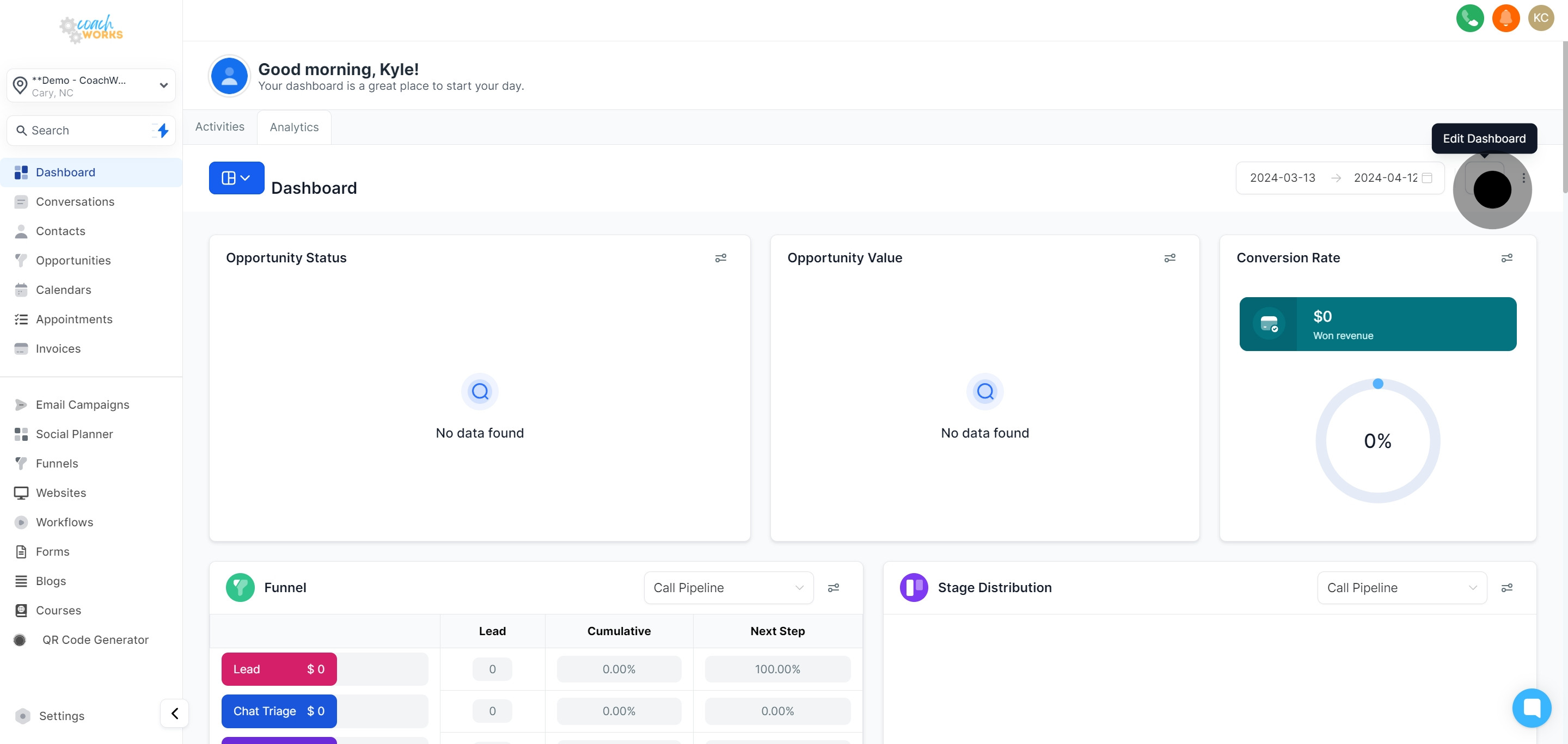
Navigate to the Analytics section of CoachWorks Marketing to start customizing your dashboard.
Look for the pencil icon and click on it. This action allows you to modify the current layout of your analytics tab.
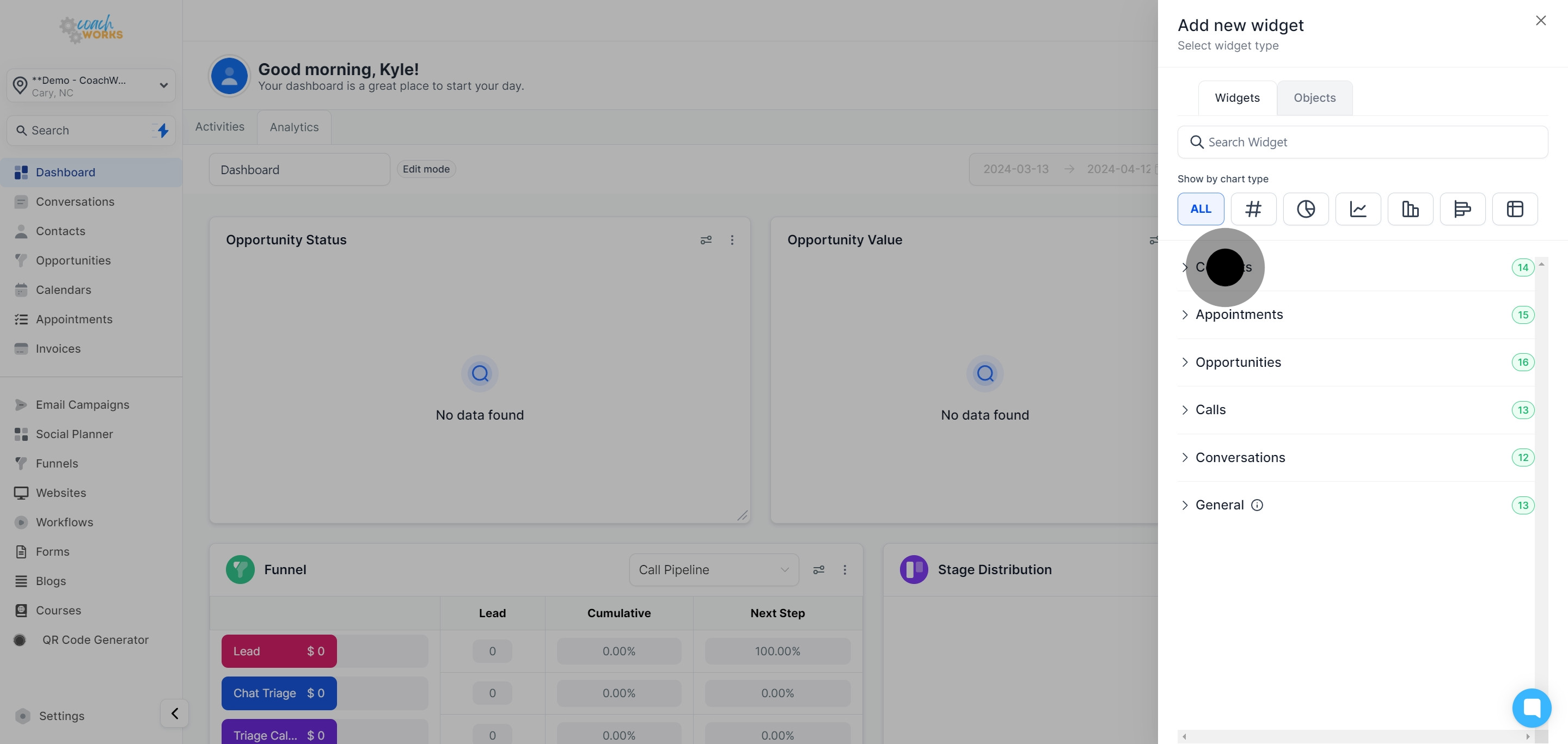
Click on the ‘Add Widget’ button to incorporate a new element into your dashboard.

A dropdown list will appear, showcasing available widget options. From here, select the type of widget you wish to add.
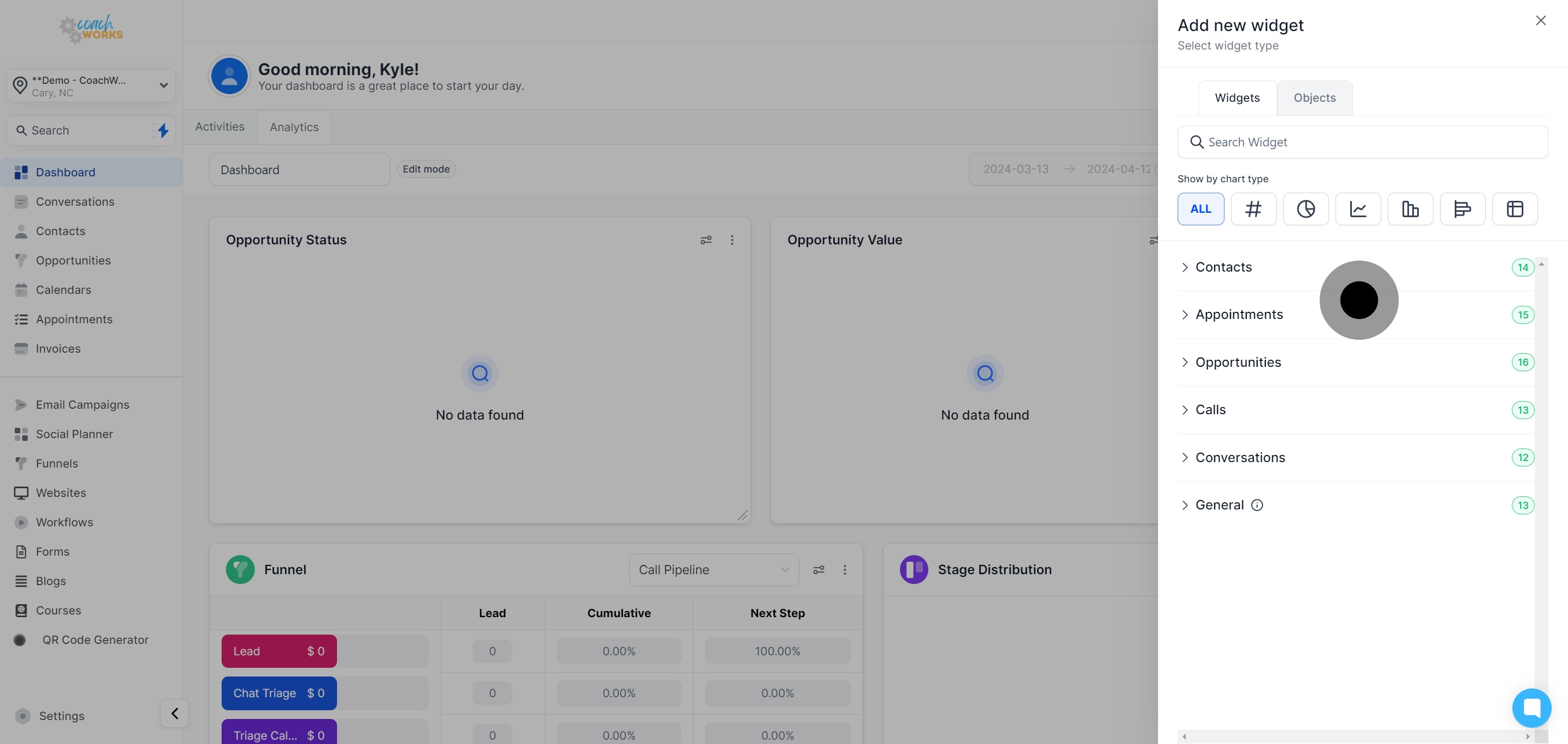
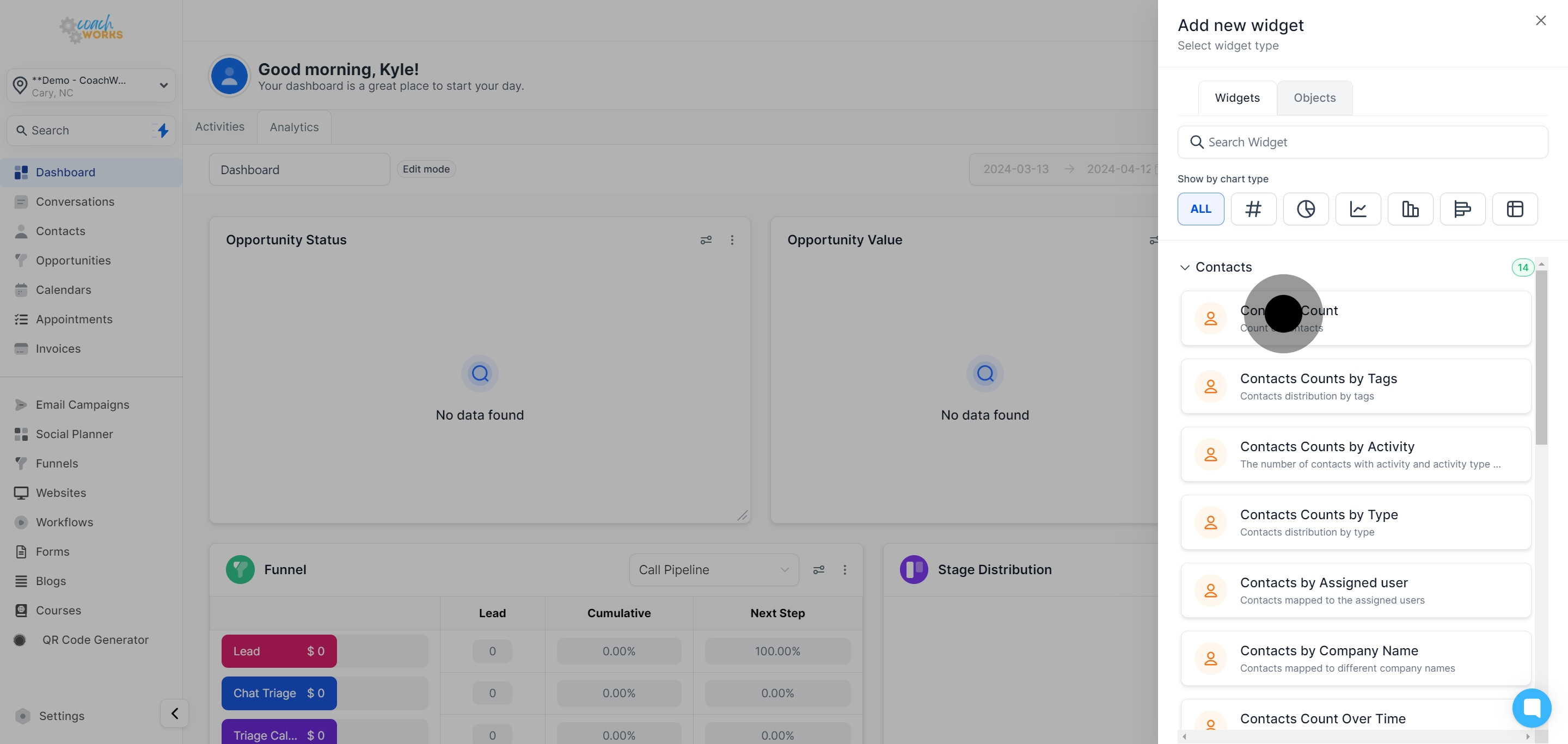
Click the ‘Contacts’ option from the provided choices to focus your widget on contact data.
From the set list, select the widget that best suits the data representation you intend to analyze.
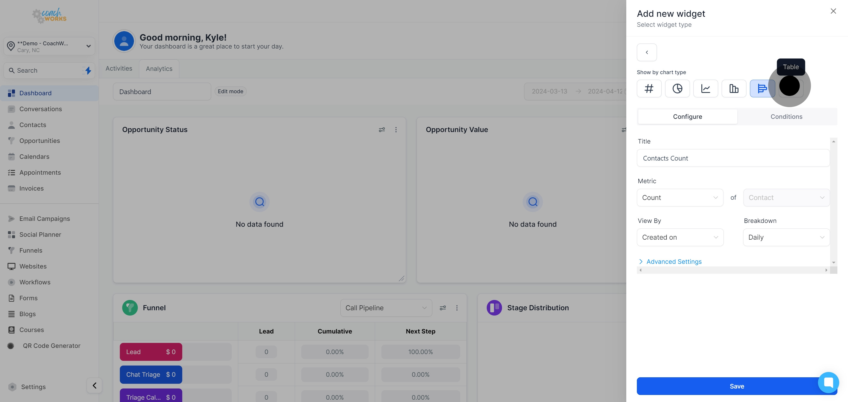
Under the ‘Show by chart type’ section, find customization options for the widget's appearance.
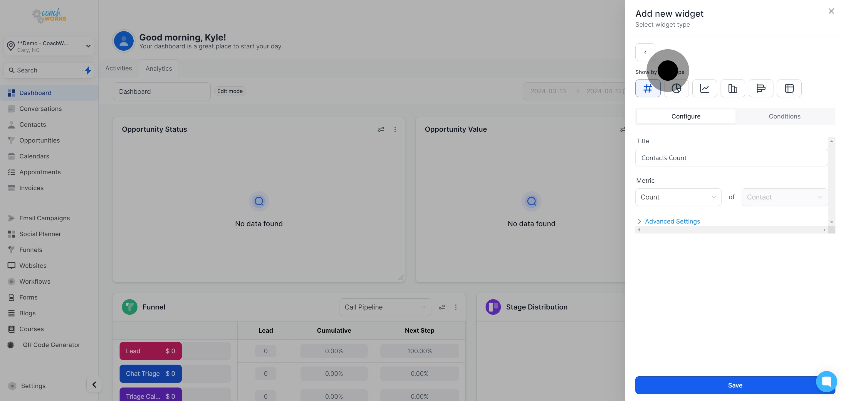
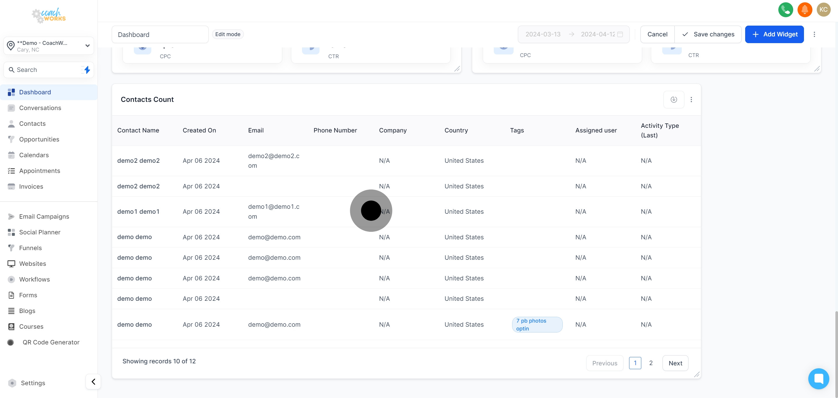
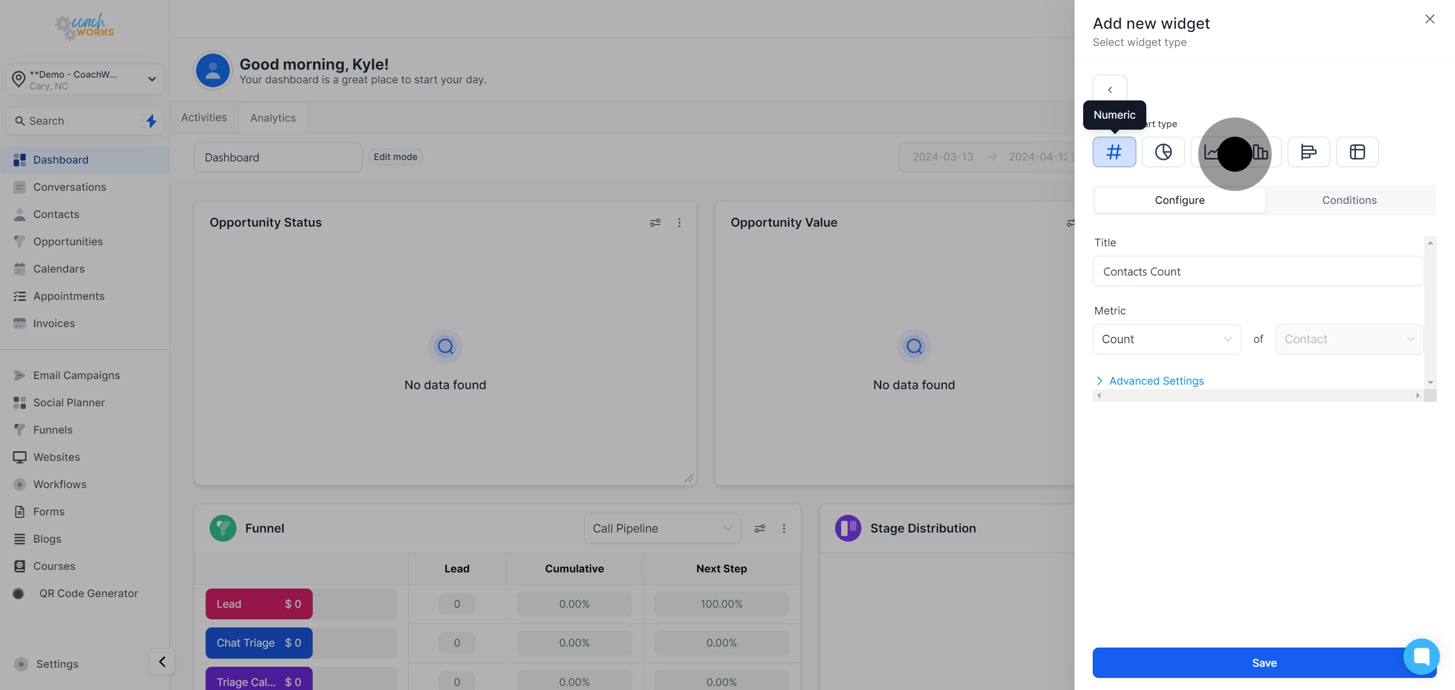
Choose your preferred widget type among numeric, donut, line, bar, horizontal, or table chart. For this guide, select the table chart option.
Enter a new title for your chart to describe the data it will display.
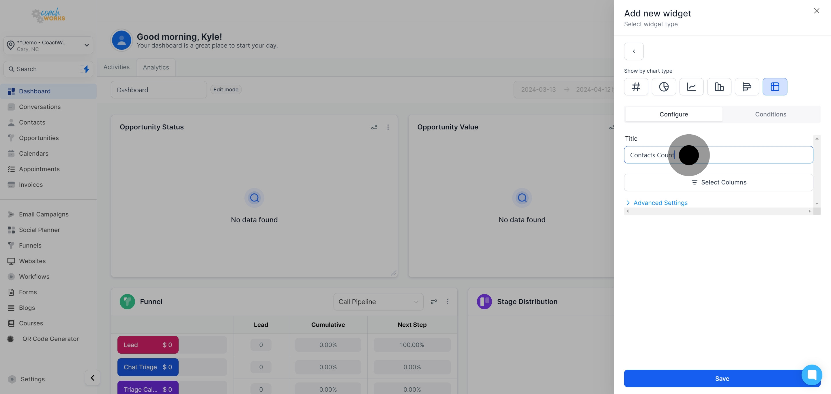
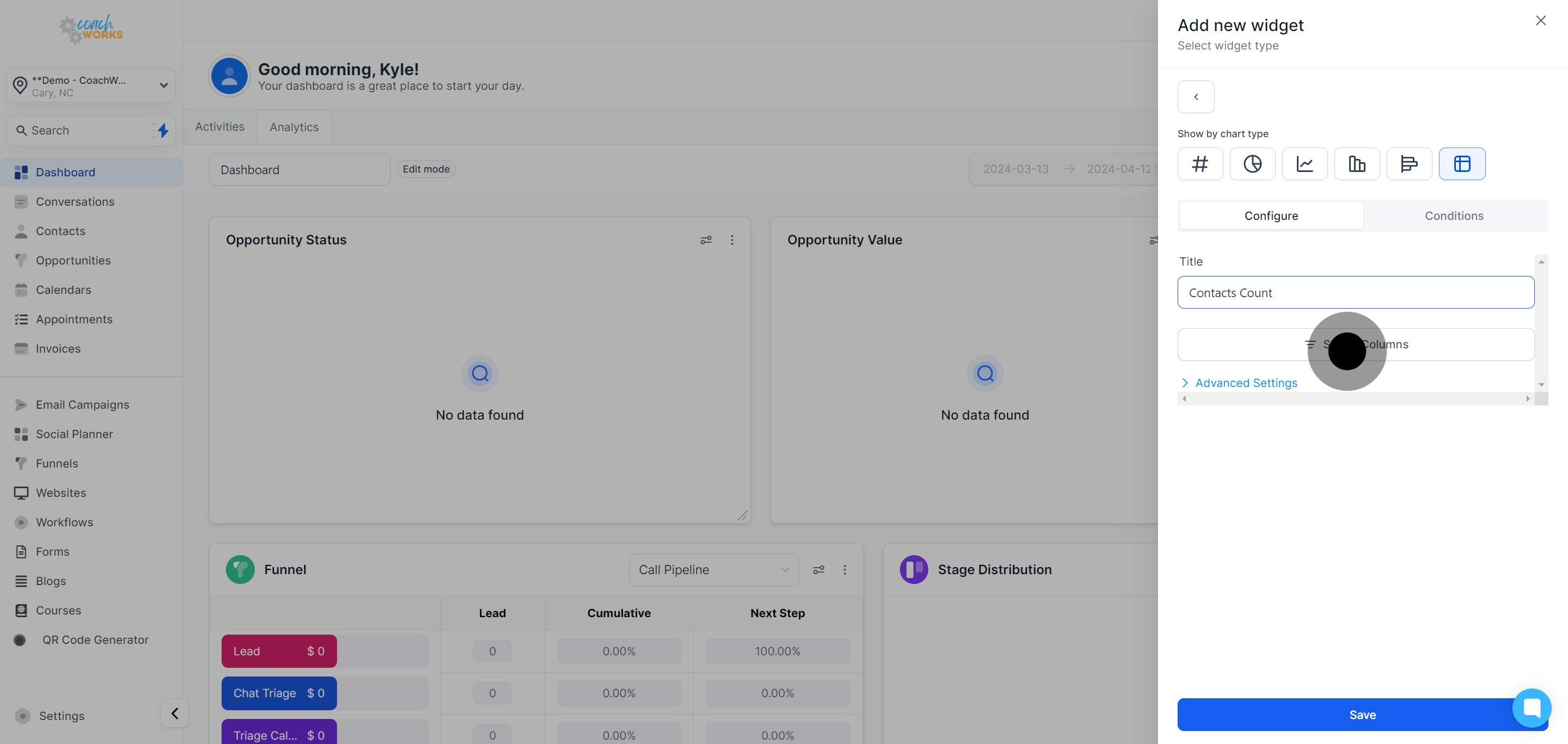
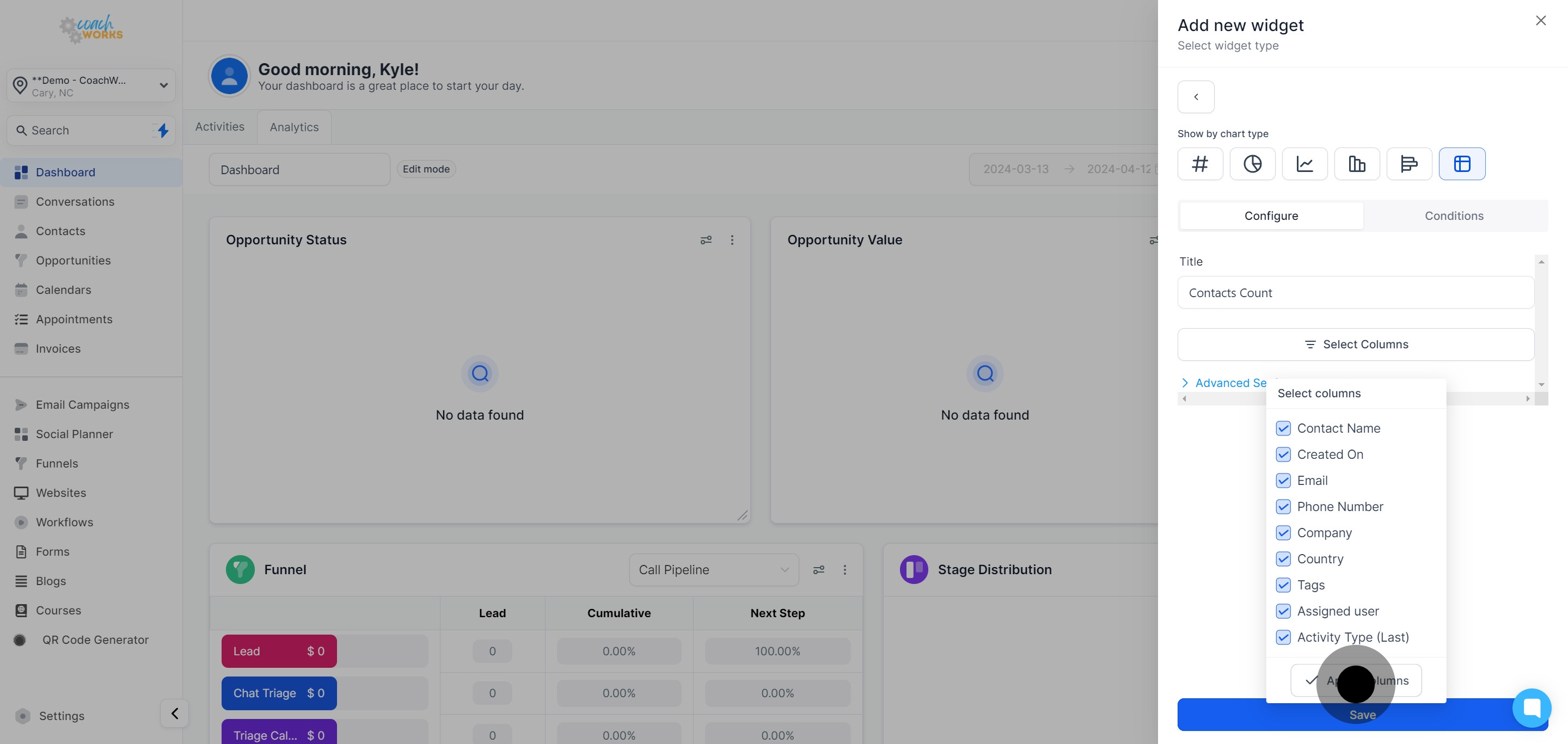
Click ‘Select Columns’ to choose which data categories you want the widget to display.
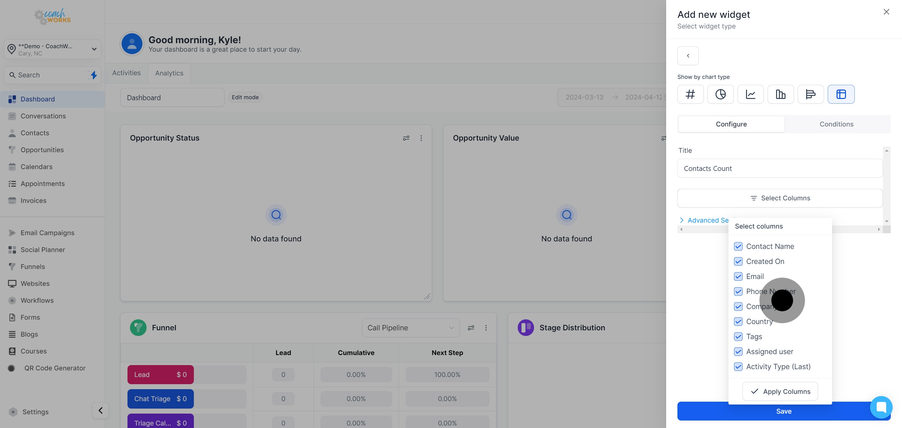
Once you’ve selected the desired categories, click ‘Apply Columns’ to update the widget.

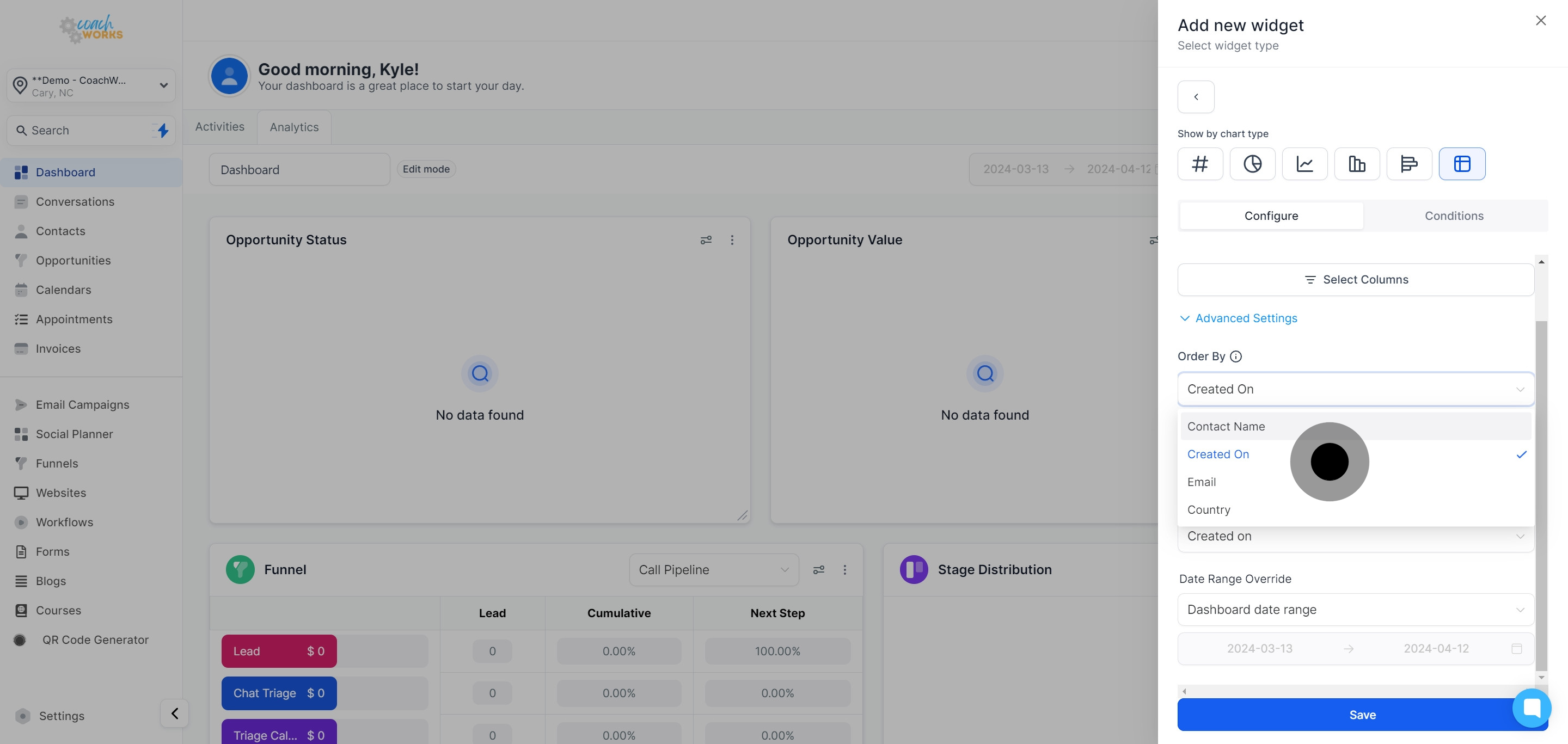
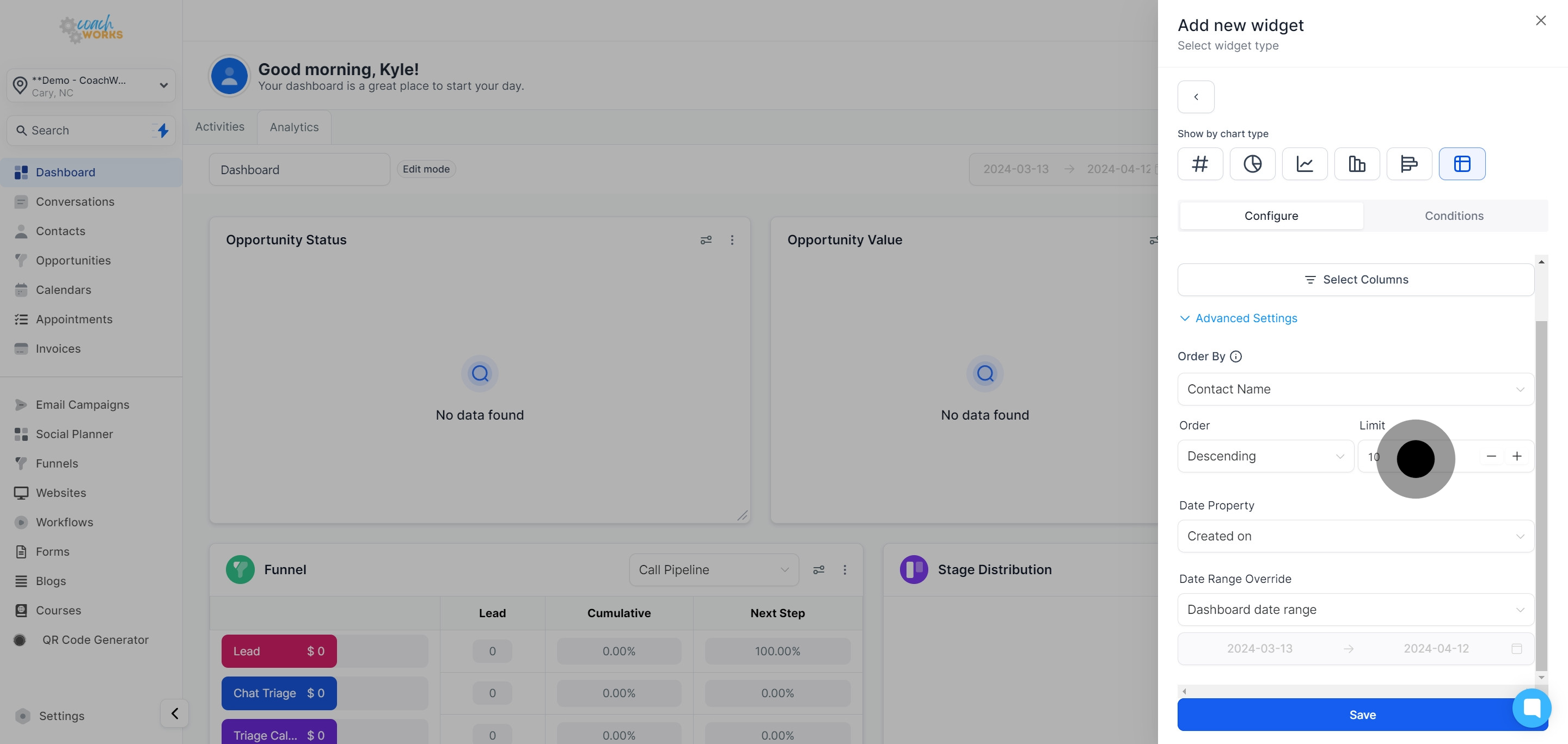
Choose the order in which your data will be displayed within the widget, selecting either ascending or descending order.
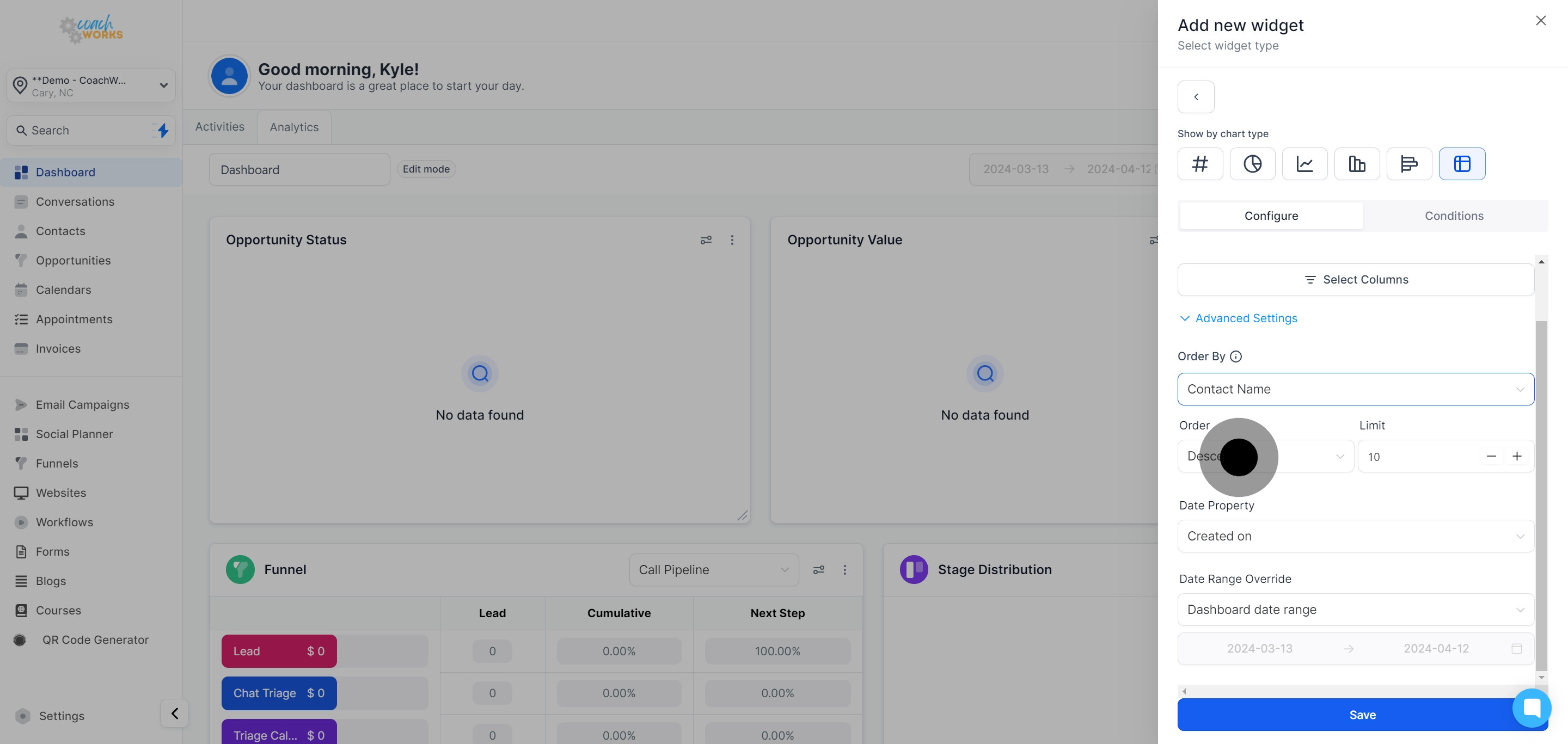
Set the number of contacts that will appear in the widget, customizing its density.
Adjust the Date Property to specify which date range the widget should consider for displaying data.
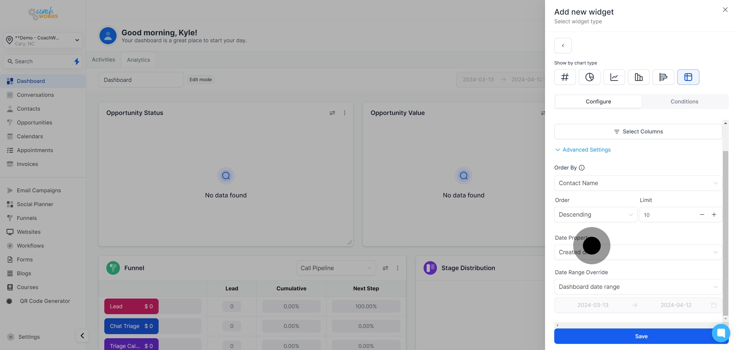
Tailor the dashboard Date Range according to your analysis needs.
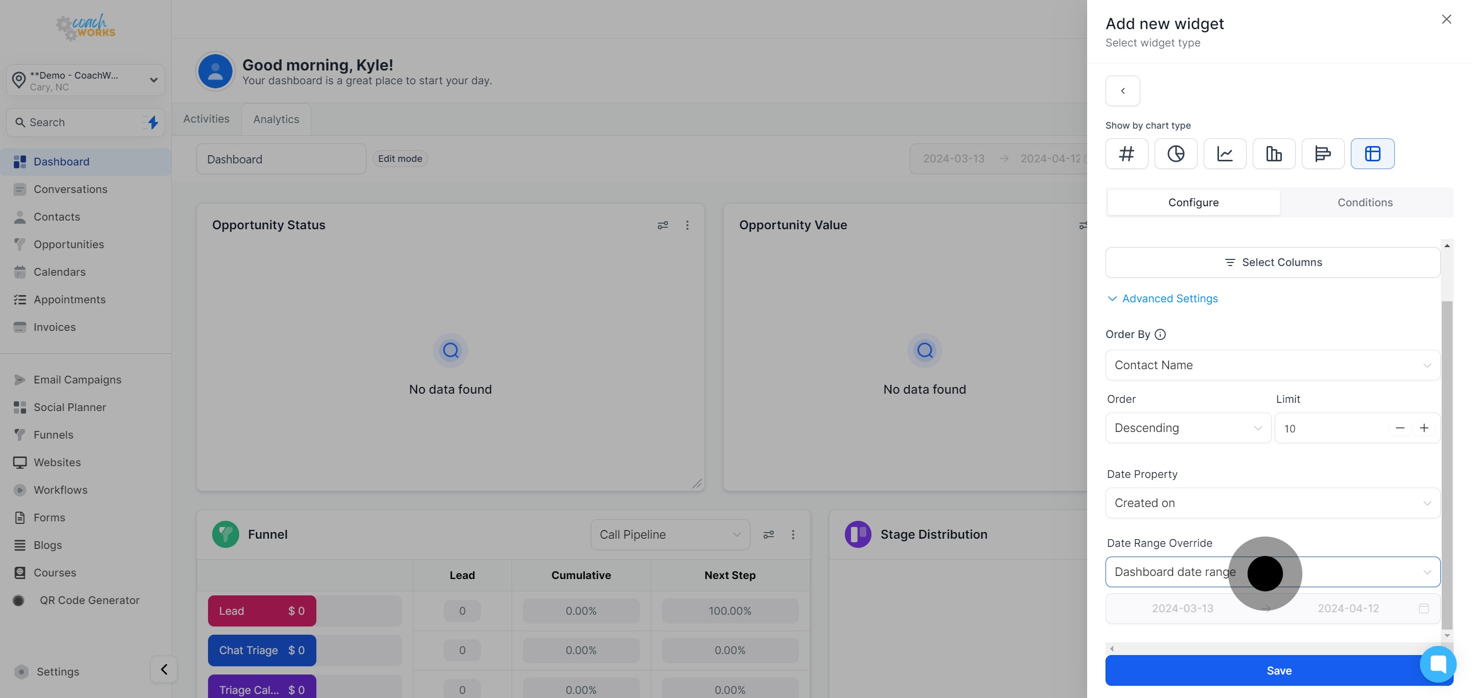
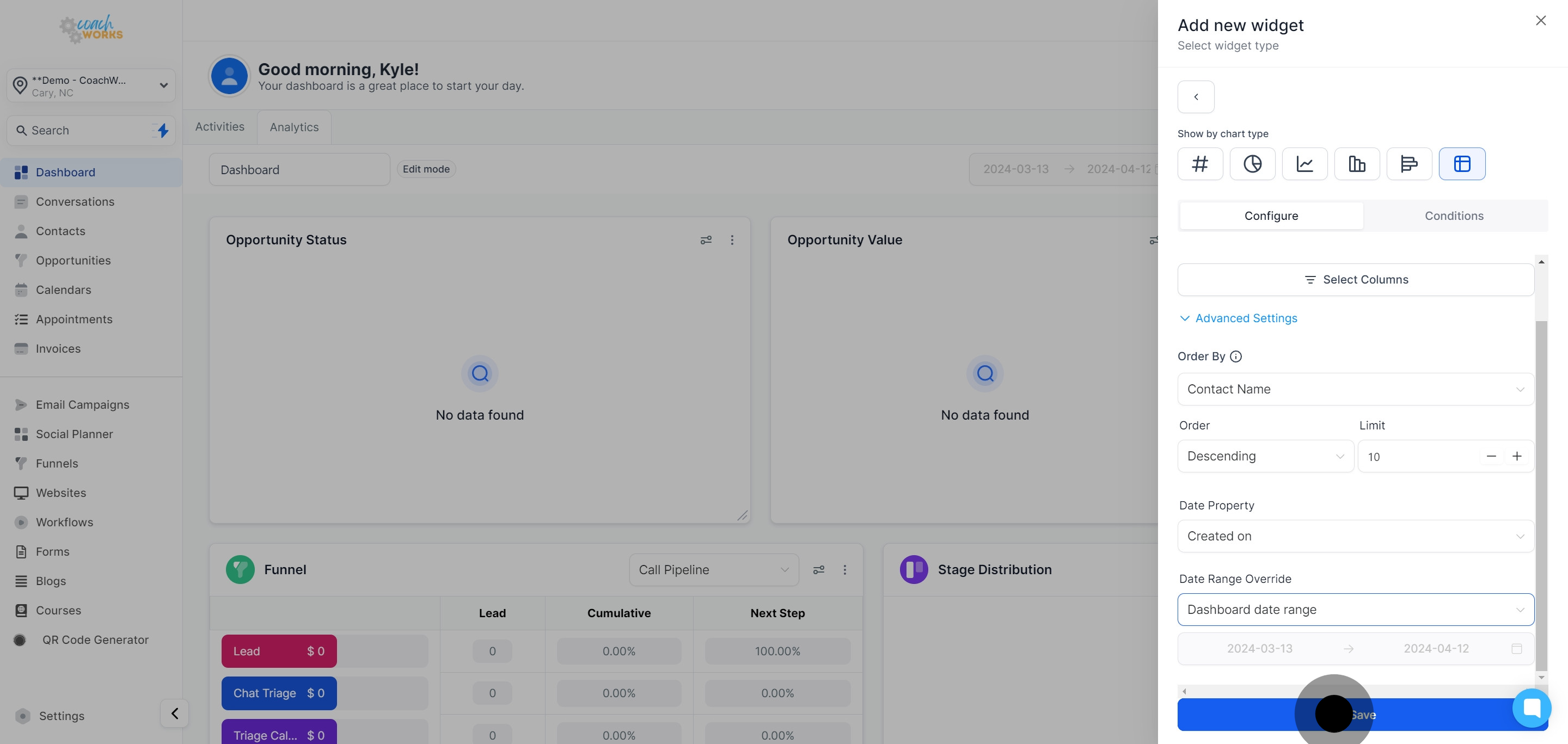
Click ‘Save’ to preserve your custom widget settings.
Your newly created table chart widget will now appear at the end of your analytics dashboard.